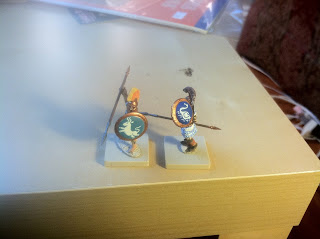
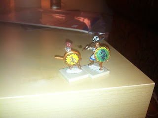
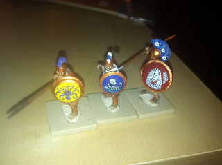
My hoplites do not share a color scheme on their uniforms and each one has a different design on his shield. I've been told that a unit looks better when all the fighters are uniform, but I have declined to follow that advice. For starters, I collected these hoplites from half a dozen different manufacturers and since their sculpts don't really match (some have a breastplate and others a linothorax; some have a tunic and some are naked), matching the outfits is out of the question. There's also the issue of my getting bored painting the same design over and over.
But the larger issue is a historical one. A hoplite was a middle class man rich enough to afford panoply but not a horse. Except in Sparta, where the state issued each soldier a red cloak (doesn't show blood) and a Lambda shield, a citizen was expected to provide his own armor. In many cases it would be handed down from father to son. I doubt your average phalanx was uniformed.
The Greeks were a far more individualistic culture than the more collectivist cultures of their contemporaries in Persia, Egypt, and the rest of the Near East. Each hoplite's shield was his opportunity to make a statement -- about his self-image, artistic sensibility, even his sense of humor. One fighter had nothing but a life-sized fly painted on his hoplon. He explained that in battle, he would get right in the enemy's face and the fly would seem to be the size of an elephant or a dragon or something. Anyway, every hoplite gets a unique shield. Here are my better ones.
A ram's head and a woman's head, again, one color for negative space with details painted on with a second color. These are also notable for my attempts to do a simplified meander (or "Greek Key") around the central design. It looks good unless you study it very closely and note how inconsistent the design is. This does not bother me because how often is a player going to pick up a mini and study it so critically? From 2 feet away it looks great.
Athlete with discus and seahorse, again notable for nice borders.
Bunch of grapes and amphora. On the grapes I had this fool idea to paint three Eroses (cherubs) flying with a red ribbon. The figures don't read very well because I couldn't do details that fine. I won't try anything quite that intricate again.
An octopus, a trireme, and a woman coming her hair. I love putting womens' faces on hoplons.

Bull, swan. These are two of my best one-color designs, just using the background color as negative space. Sometimes the simplicity of one color designs makes them look a little kindergartenish, but sometimes I get elegant simplicity and I think that's what I've gotten here.


No comments:
Post a Comment